


Gone are the days of flipping through brochures or standing in line at a travel agency; now, the world is at our fingertips, waiting to be explored with just a few taps on our screens.
At the heart of this digital revolution are apps like Airbnb, where the experience of finding your perfect getaway is just a tap away. But in this bustling online marketplace, creating an experience that stands out isn't just a challenge—it's an art form.
Since the coronavirus situation, the vacation industry has been bearing the brunt. Now that the situation has eased a bit, apps aspiring to be Airbnb should rethink their UX designs to capitalize on the opportunity when users want to go out on a vacation.
To gain this competitive advantage, we will first recognize the current UX design for Airbnb and then evaluate the improvements.
What is the Current UX Design for Airbnb?
From the standpoint of UX design for Airbnb, designers have differentiated content into different chunks to keep users focused on a single block at all times.
There are two advantages of block-based user interface:
- Organized content gives a better impression to first-time visitors. Users can find what they are looking for within the category of a particular block.
- Airbnb has a simple layout that loudly speaks–Click, do your task, and go–with its simple and clear design approach.
In addition, Airbnb has followed yet another smart UI/UX pattern.
The Z-pattern
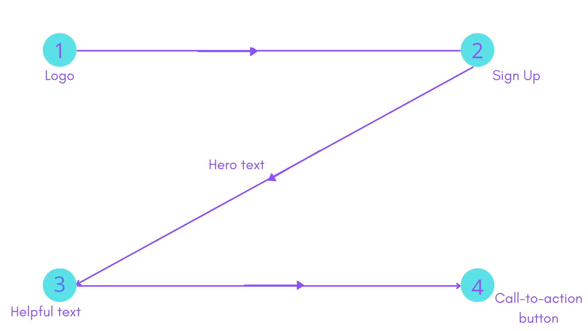
What is the first thing you do after visiting any web page or an app, it is a natural human tendency to read in a Z-pattern.
The first step a user takes is to start reading/scanning horizontally from the left towards the right. Next, a user takes a diagonal scan from the right towards the right, as if forming the second line of Z. Lastly, the user again begins scanning from left to right, thereby completing the Z.
Such an approach is followed by the top websites and apps–Everbrite, Facebook, and even Airbnb.
Airbnb has a CTA right at the pattern when Z ends, thereby directing users to their next step of action. However, whether the current UX pattern is working or not, can be identified using an empathy map.
Analyzing the User Experience of Airbnb Using Empathy Map
Let’s take a look at the user experience of Airbnb.
Airbnb gradually narrows down users’ choices to help them penetrate deeper into the app and finalize their accommodation.
Below is the psychology behind the user flow of Airbnb:
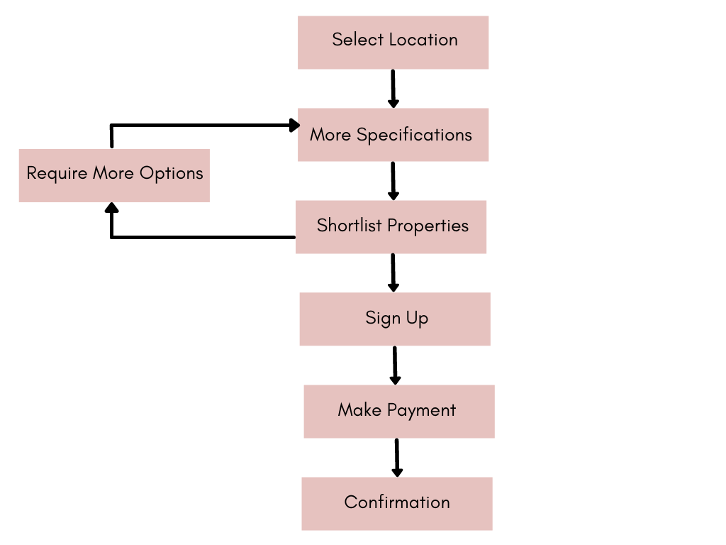
In the first step, users select the country that they are going to visit. This helps the app process accommodations from specific countries. |
In this step, users specify their exact needs as to the total number of beds, people, budget, amenities, etc. to receive relevant searches. |
After going through multiple options, users can shortlist some properties. They evaluate the prices and amenities, share information with their friends and families, and then make the decision. |
Once they have decided on the accommodation, Airbnb requires them to sign up on the portal to verify these users. |
Upon signing up and finalizing all details, the app leads the user towards the payment module. Users can select from among various payment modules. |
The home keeper confirms the booking, and the app sends the confirmation details to both the host and the guest. |
All this way, there are some positives as well as negative factors affecting the user experience
Let’s define the user experience of Airbnb app by defining the user persona:
- College-going students (16-20 years)
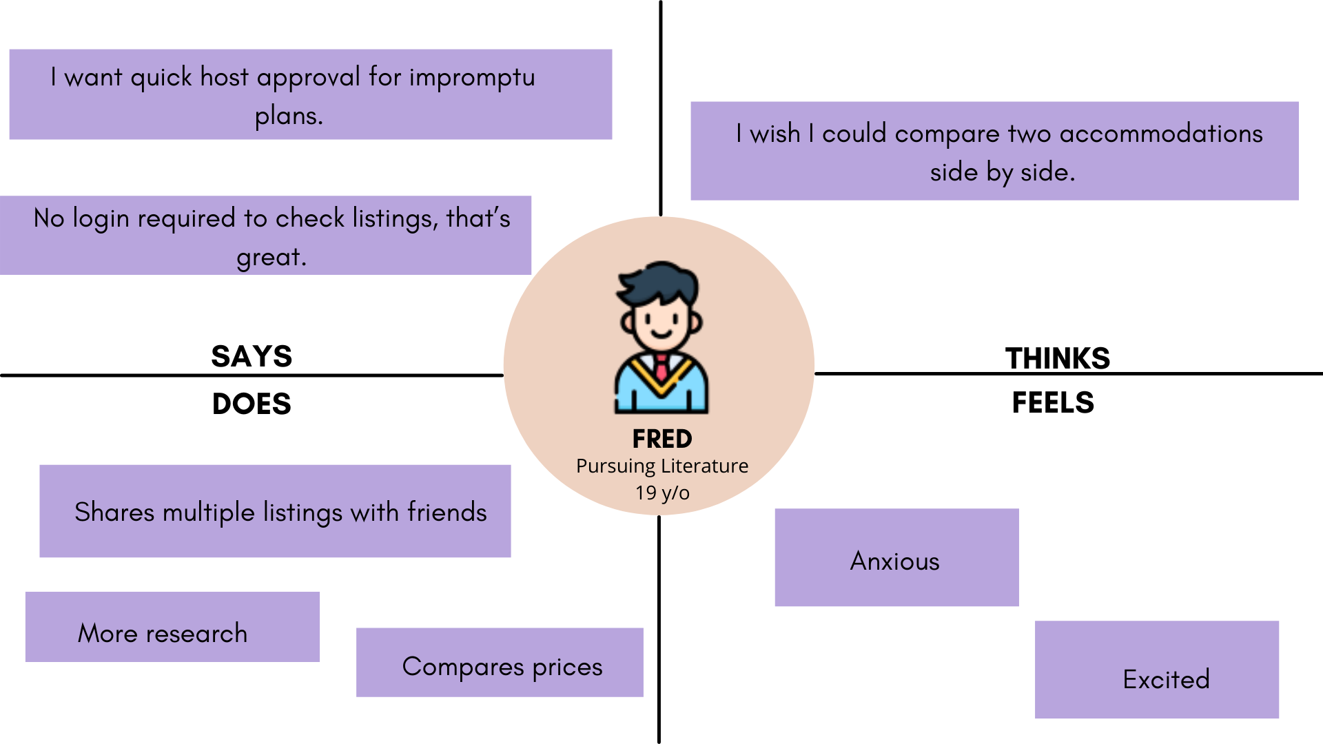
- Working professionals going for a vacation with friends (21-30 years)
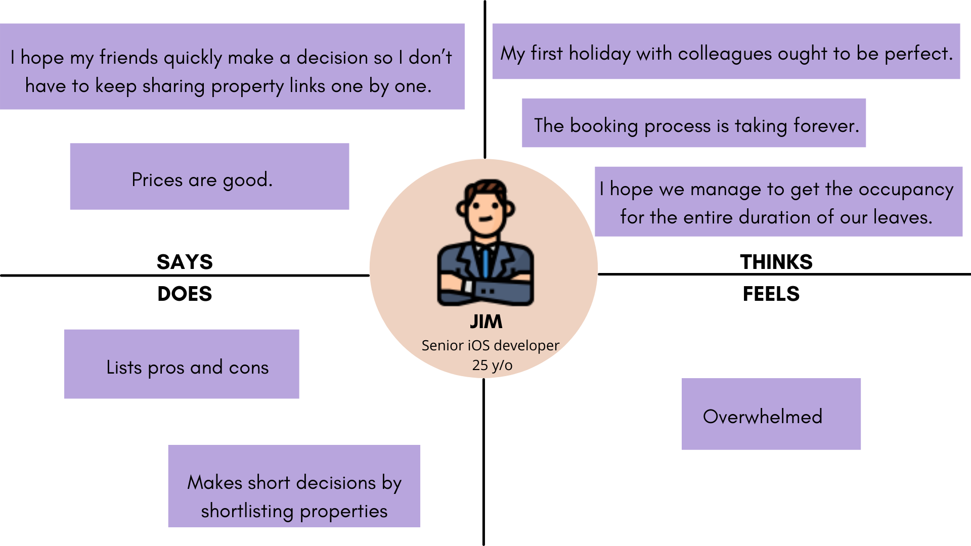
- Couples going for a vacation (25-40 years)
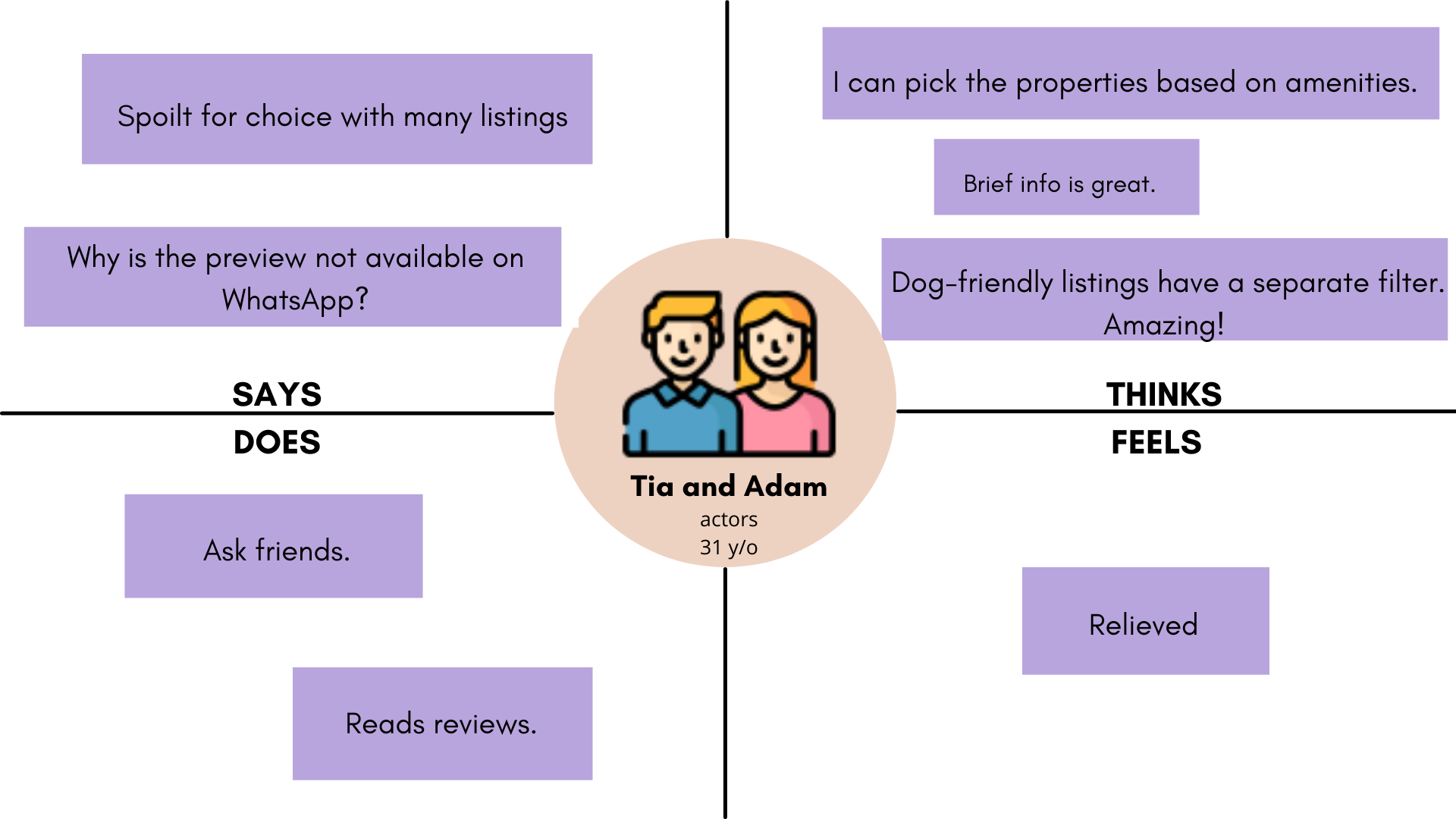
- Family tours (20-50 years)
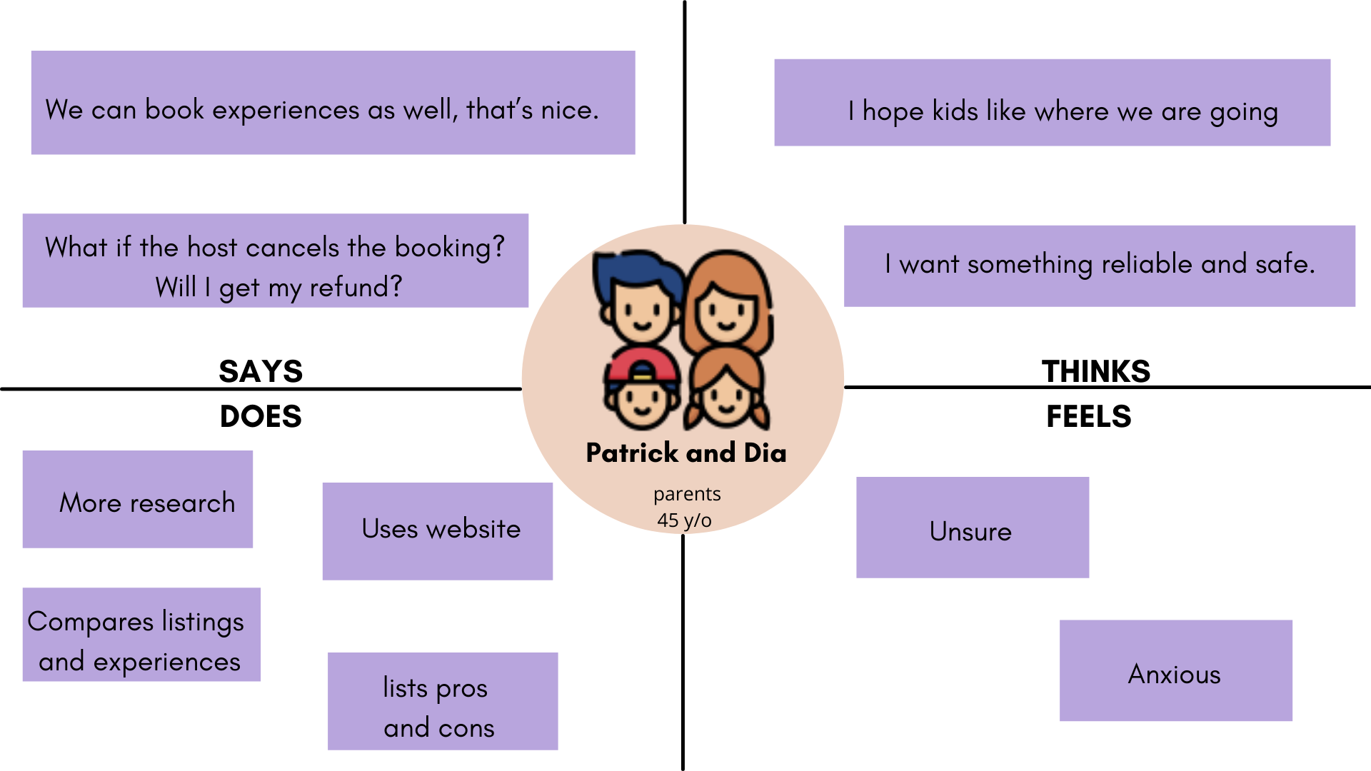
- Professional going on a business trip (25-45 years)
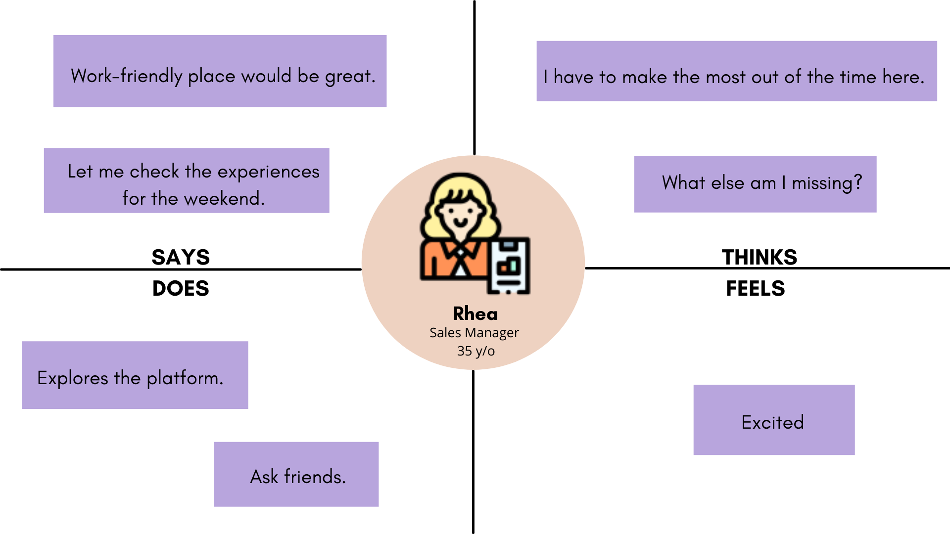
If Airbnb has brownie points that stand no chance for new players in the vacation rental industry, it also has pain points that crack open a little space.
If you find these cracks in the user experience of Airbnb, you are sure to make opportunities in the vacation rental industry against the giant.
App Map – How Should You Design UX for Airbnb like Vacation Rental App?
Most UI/UX designers would know the app design process–Research, define the roadmap, ideate user flows, prototype, and conduct usability tests.
Let’s look at the features’ roadmap. We can determine these into three categories–Most viable propositions, advanced features, and nice-to-have ones but not necessary.
- Most Viable Propositions
- Advanced Features
- Nice-to-have Ones
These are the top features that users need in a vacation rental app like Airbnb. The next step is to ideate the App Map to navigate users to the page they intend to be on. You can consider it as information architecture for users.
Home Screen
There are three prominent options on the home screen for users.
- Places to Stay
- Experiences
- Online Experiences
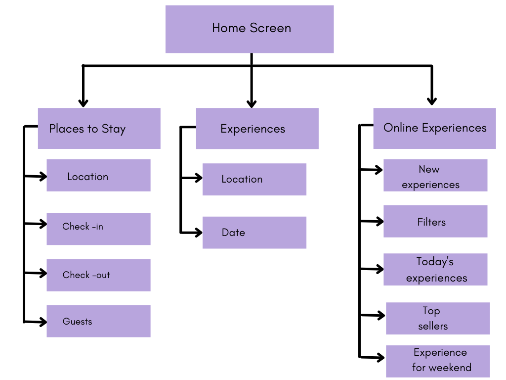
By default, users see Places to Stay as the option when interacting with the Airbnb website/mobile app. Here users need to add details such as–Location/Check in date/Check out date/ Number of guests. Upon adding these details, users can click/tap on the search option to land on pages with listings.
The second option is the experiences. Users can add the location of their destination and the date for which they wish to visit the place. Upon tapping on the search option, a number of experiences along with filters will appear before them. The F-shaped UX design makes it easier for users to scroll through and scan the experiences.
The third option is Online Experiences. Users do not need to put any kind of detail, such as date or location to access this feature. However, they will have the option to filter the activities and look for time-bound events by selecting the dates.
Explore Nearby
Another prominent feature that the app includes is Explore Nearby. Upon hitting on the feature, users will find options for nearby places to visit along with the accommodations. Alternatively, when they scroll down the app, they will find the nearby top spots with an estimated time of the drive.
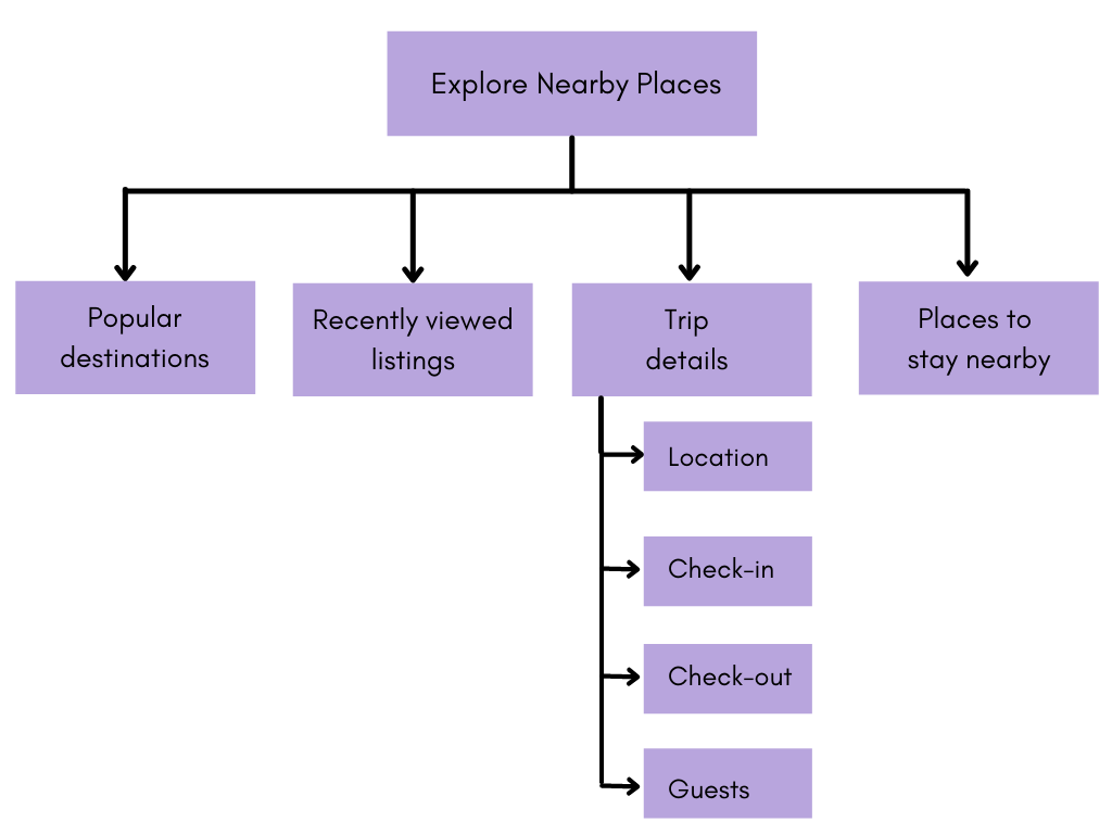
Below this, users can explore the multiple vacation rental categories as defined by Airbnb–Entire homes, Unique stays, Cabins and cottages, and Pets welcome.
Upon clicking any of these, users will be redirected to the listings, wherein they can find more details about the vacation rental accommodations. There is a map integrated to help users pinpoint the exact location that they are heading towards.
Listing Page
Users browsing through vacation rentals encounter a plethora of options on the listing page. From viewing captivating images of the accommodation to perusing cancellation policies and house rules, every detail is at their fingertips.
They can effortlessly confirm availability, contact the host, and even read reviews from previous guests. Additionally, related recommendations provide further insights into their potential stay.
Sharing the excitement of discovering the perfect rental is made easy with options to share links via social media platforms like Facebook and Twitter, as well as messaging apps such as WhatsApp and Messenger. Users can also bookmark their favorite listings for future reference, ensuring seamless planning for upcoming trips.
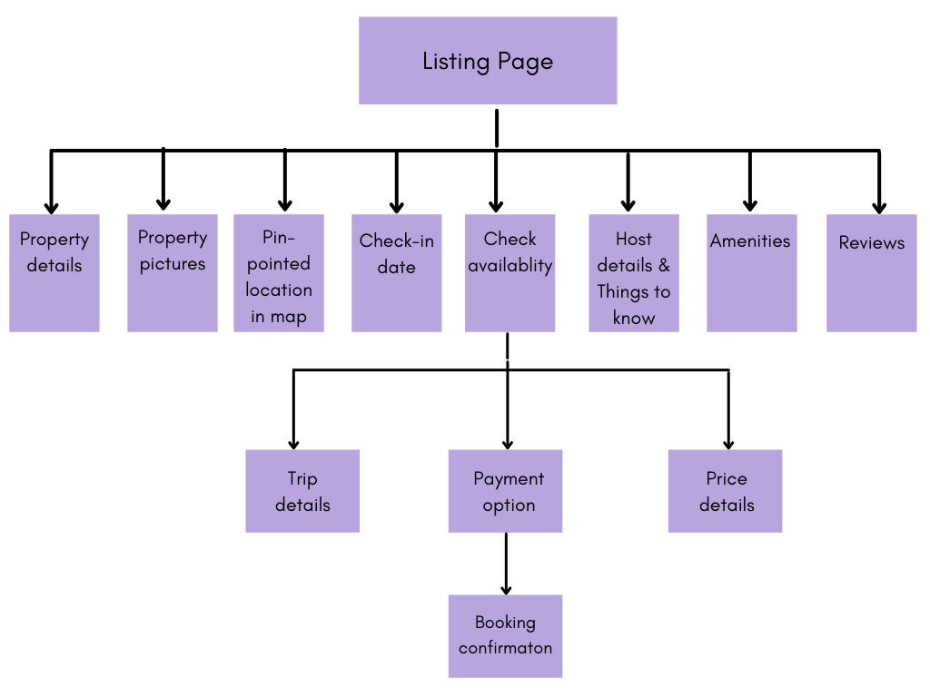
Upon selecting dates and proceeding to checkout, users are presented with a confirmation window detailing their booking and pricing information, including the cancellation policy. With a simple confirmation, users can proceed to make secure payments. Upon completion, both users and hosts receive confirmation details via email, ensuring a smooth and transparent booking process.
How to Enhance the App Flow and Improve User Experience of Airbnb like Apps?
We have come up with three solutions to help you stand up to the vacation rental giant with better solutions for improving the user experience of Airbnb like apps.
- Share Favorite List:
Currently, Airbnb does not have multiple link sharing options for users. As a result, users have to hop between social media apps and Airbnb to share links with users.Users should be able to select multiple properties using the checkbox feature and share it with their friends/family using a single click/tap.
- Compare Listings:
It is a common dilemma for users to select from among two vacation rental accommodations. Hence, users have to open listings to check for all the features and then open yet another tab with another short-listed accommodation to hop between these two tabs and make the comparison.
Alternatively, if a feature is developed to allow users to view a heads-on comparison of two or three accommodations, it can bring ultimate ease to users.
- Prioritize Visuals at all Times:
One of the lessons that Airbnb learnt the hard way was poor photography. Users seek a better experience at the cost of their earnings when they are off to a vacation. Hence, it is wise to allow listings with only high-resolution pictures to entice users and provide them with a better idea of the vacation rental.
Can you Beat Airbnb?
No two mobile applications or online businesses can exactly be the same. Hence, when one application in the vacation rental industry is sitting at the top, it surely has a dissatisfied cohort or at least the ones wishing that some features would have been better or slightly different.
You have to pick up on users’ wishful thinking and adopt a design thinking yourself–that’s the only secret of being the next big vacation rental mobile app.
Besides this, the Airbnb app remains untouched from the touch of the technology. Latest technologies such as voice search, virtual reality, and the Internet of Things can help further improve and target the millennial populace.
Besides this, chatbots can assist users stuck at any point on the app by taking them where they ought to be.
This is some insight we are sharing with you. You can further talk to our talented UI/UX designers to gain more practical information on planning UX design for Airbnb like apps.
Alternatively, we can develop an Airbnb like app from scratch for you with better UI/UX designs and features that resonate with your users.
Talk to our creative team to get innovative solutions
For improving the user experience of Airbnb-like applications
FAQs
Airbnb's user experience revolves around intuitive search and filtering options, visually appealing property listings with detailed descriptions and high-quality images, transparent pricing and booking process, and seamless communication between hosts and guests. These elements ensure a smooth and enjoyable experience for users throughout their journey, from browsing listings to booking accommodations.
Airbnb focuses on simplifying the booking process and enhancing customer satisfaction by prioritizing user-centric design principles. This includes offering personalized recommendations based on user preferences, providing clear and concise information at every stage of the booking process, and facilitating seamless communication between hosts and guests. By putting users' needs first, Airbnb ensures a positive experience for all parties involved.
Technological innovations such as machine learning algorithms for personalized recommendations, dynamic pricing models based on demand and supply, and secure payment processing systems have played a significant role in Airbnb's success. These innovations improve user experience, increase efficiency, and foster trust among hosts and guests, ultimately driving the platform's growth and success.
Airbnb fosters community engagement and trust among users through features like user reviews, host verification processes, and social networking functionalities. By allowing guests to leave reviews after their stay, verifying hosts' identities, and facilitating interactions between hosts and guests, Airbnb creates a sense of accountability and transparency that builds trust within the community.
TRooTech is a trusted choice for developing accommodation booking apps similar to Airbnb. With expertise in user experience design and cutting-edge technologies, TRooTech creates customized solutions tailored to clients' needs. By applying innovative features and prioritizing user satisfaction, TRooTech ensures the success of accommodation booking apps in today's competitive market.
