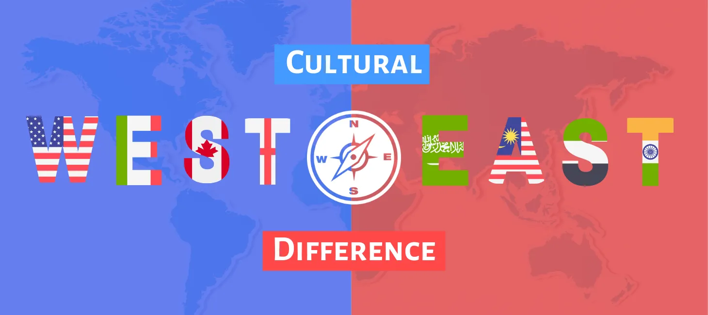
Master UI/UX sense with McDonald’s Cross-Cultural Web Design Guide
Know more about the art of seamless user experience with McDonald's Cross-Cultural Web Design Guide, offering personalized search, privacy features, notifications, and chat options to take your digital journey to new heights.

You might have heard of personalized search options, personalized features for user’s privacy, customized notifications, or personalized chat options for app users.
But have you heard of personalized web design as per the culture of different countries?
Yes, a typical Human-Centered Web Design fills all the void.
Or have you encountered any multinational company's personalized cross-cultural web design?
Nay? Yay? Or Umm?
Let us clear out your guesswork with McDonald’s cross-cultural web design guide.
Any startup wanting to internationalize or even a money-making business flourished in the home country is always tempted to expand its reach to new locations.
Simply switching the currencies translating language or re-formatting a few fields on the website is not sufficient for any business to expand geographically.
As it is always said ‘It takes two to tango’.
Considering the cultural influences in the app design goes hand in hand with the basic formatting for internationalizing a website.
‘From being right or kind, let the web design choose to be kinder to the app users.’
A recent survey shows that 67% of global app users are highly satisfied with the culturally adaptive UI (user interface).
Countrywise localizing an application can be the best way to combat the challenges of cultural diversity.
Because…..
The ecosystems of consumers in different countries are very unique. It is based on:
- What makes them trust the website?
- What can catch their attention?
- How do they go about searching for information?
- What are the triggering points of converting them from a visitor to a customer?
- What do they consider relevant in a website?
Present-day web designs need to touch the local culture to get those 2 million app users to experience the offered product/services.
Well! There are also a few entrepreneurs who try to take a shortcut out of this.
They think of having one universal UI/UX design that suits all the cultures across different countries. But that’s a wrong move.
Just as the business has to make its product range to adapt to different cultures. No matter how weird flavors or odd product combinations they have to deal with.
For instance, a cheese pizza flavored M&M candies…. Anyone?. hahaha
The same goes with the cross-cultural web design to adapt to the cultures…..
There are chances that a web design works magic in China or Korea but seems to be very gaudy for the Canadian audience who love the minimalist look of web layouts.
The companies now need to rethink the app layouts for different cultures INDIVIDUALLY.
Considering this, it’s so very critical to understand the cross-cultural elements in web designs.
Elements that impact the Cross-Cultural Web Design:
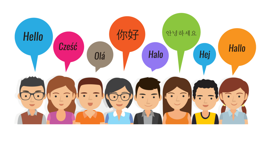
In the world of web design, culture is a medley of language, color, time, behaviors, attitudes, values, beliefs, traditions, and even the way of orientation.
Every process of web designing critically depends on cross-cultural elements.
Have you come across any cross-cultural web design that has interesting examples, the real-time case of a well-known company, and an easy-to-understand explanation of the topics?
Nope?
Well then! You will love to go through the following cross-cultural web design guide.
Look at some of the real examples of elements in cross-cultural web design:
For instance, while red is associated with love and passion in the West, it symbolizes purity in India, luck in China, and even death in parts of Africa. Similarly, device preferences differ between cultures; Japanese users prefer flip-style smartphones, whereas Americans opt for broad keypad devices like Blackberry.
These examples illustrate the importance of understanding cultural nuances in design. From color choices to device preferences, designers must consider diverse cultural perspectives to create engaging and inclusive experiences.
Cultural aspects matter the most especially for:
- The logo placement on a website
- Designing a search bar
- Using the visuals
- The way of presenting and sharing contact details on a website
Entrepreneurs need to take the UI/UX of the website as a ‘long-sustaining chess game’ rather than taking it as a ‘temporary checkers game’ while creating a cross-cultural web design.
Today, personalizing web designs for each culture of every country in which the business is expanded has become one of the chief must-haves.
For this, there exists a globally recognized and standard theory to analyze the cultural differences that have helped many businesses to outshine internationally.
Geert Hofstede’s Cultural Dimensions Theory:
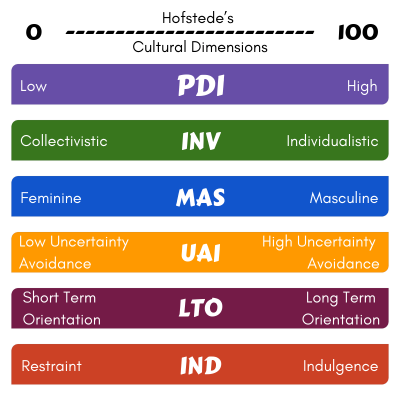
In the 1970s, psychologist Dr. Hofstede conducted extensive research to identify fundamental elements of culture that could be measured and compared.
This led to the development of six cultural dimensions:
- Power Distance
- Individualism versus Collectivism
- Masculinity versus Femininity
- Long-term versus Short-term Orientation
- Uncertainty Avoidance Index
- Indulgence versus Restraint
Understanding these dimensions is crucial for creating a cross-cultural user experience (UX) and user interface (UI) on websites.
Curious to discover your country's score for the six Hofstede dimensions? |
Get a comprehensive analysis of Hofstede Cultural Dimension Values for your country by providing your details below. Our team will reach out to you with precise information tailored to your needs. |
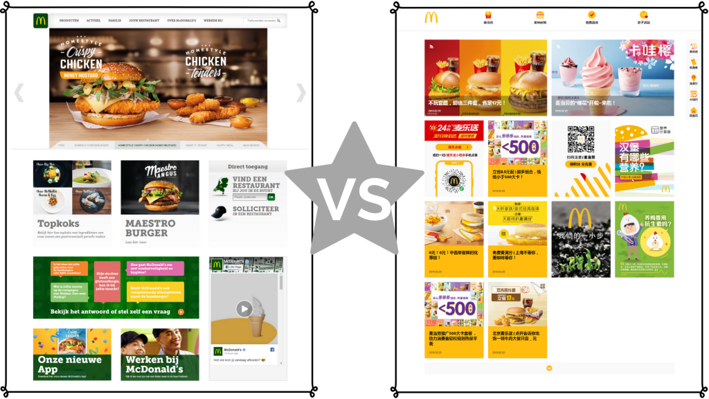
One notable example who has implemented these dimensions in its cross-cultural web design strategies is McDonald's, which tailors its website designs to each country's unique cultural preferences.
By personalizing the user experience based on cultural dimensions, McDonald's ensures that its website resonates with audiences worldwide.
To delve deeper into the intersection of cultural dimensions and web design, let's explore a fascinating case study of McDonald's website designs customized for different countries.
This case study provides insights into how cross-cultural web design development can effectively bridge cultural gaps and enhance user engagement.
Case Study: McDonald’s Globalization + Localization
In all seriousness, McDonald’s has focused on Hofstede’s cultural dimensions.
For each dimension, we will go through the design elements of McDonald’s national websites and its homepage designs.
1. Power Distance
Power Distance is the degree to which the customers or people accept the inequalities among individuals based on the power (authority, control or influence).
- A high power distance means a high level of acceptance of the unequal distribution of power.
- A low power distance refers to the less acceptance level of unequal distribution of power with a constant try to equal out the gap of power distance.
Low Power Distance | High Power Distance |
McDonald’s Dutch Website | McDonald’s Chinese Website |
|
|
By studying the Power Distance concept through McDonald’s Dutch and Chinese websites, we learn how adjusting design to fit cultural preferences is crucial.
Designers should consider cultural nuances to create familiar and trustworthy interfaces. This means using localized elements and empowering users, ultimately boosting engagement and satisfaction across cultures.
2. Individualism v/s Collectivism
Individualism is the degree to which customers focus on themselves is Individualism. It’s about the ‘I’, ‘Myself’, and ‘Self-caring’ mentality.
Whereas Collectivism is the degree to which the customers focus on a group at large is Collectivism. It’s more about the ‘We’ and ‘Caregiving’ mentality.
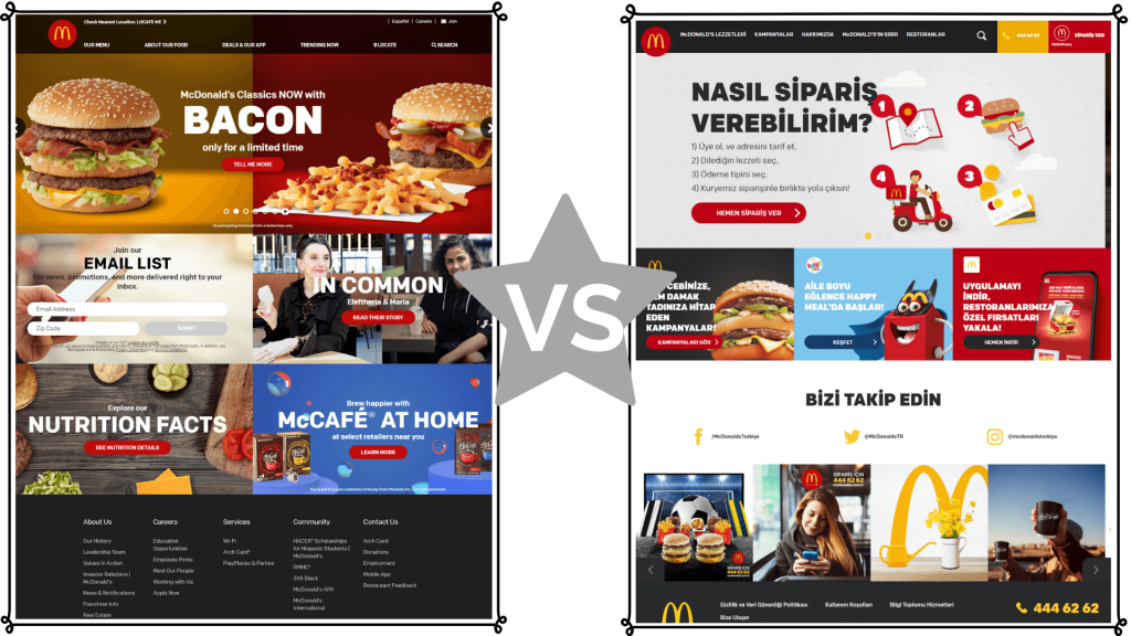
Individualism | Collectivism |
McDonald’s US Website | McDonald’s Turkey website |
|
|
By comparing McDonald’s US and Turkey websites, we see how design reflects cultural values.
The US site focuses on individual preferences, with personalized features like "Bacon meets our classics.”
In contrast, the Turkey site emphasizes social connections and recommendations. Designers should consider these cultural differences to create user-friendly interfaces for diverse audiences.
3. Masculinity v/s Femininity
A masculinity-driven society has all the traits of competitiveness, courage, passion, heroism, materialism, aggression, and assertiveness.
Whereas, Feminine society has all the traits of sensitivity, compassion, nurturance, empathy, quality of living, caring, and modesty.
Masculinity | Femininity |
McDonald’s Saudi Arabia Website | McDonald’s Norway Website |
|
|
When comparing McDonald’s websites from Saudi Arabia and Norway, we can see how the design reflects cultural values.
The Saudi site focuses on transparency and assertiveness, providing detailed information and structured navigation. In contrast, the Norway site emphasizes empathy and quality of life, offering vibrant design and openness to feedback.
Designers should consider these cultural differences to create user-friendly interfaces for diverse audiences.
4. Long-term v/s Short-term
The people with a short-term orientation believe in traditions and give more weight to the principles related to religions or their nation. They live for the present and do not bother about the future.
While the country citizens with long-term orientation are flexible and open for change in traditions and principles that majorly depend on the time, situation, or context.
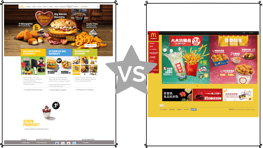
Short Term Orientation | Long Term Orientation |
McDonald’s Germany Website | McDonald’s Hong Kong Website |
|
|
Looking at McDonald’s websites from Germany and Hong Kong, we see how design reflects cultural attitudes toward time.
The German site is efficient and traditional, with quick decision buttons, while the Hong Kong site emphasizes detail and long-term benefits, with informative design and vertical navigation.
Designers should consider these cultural differences for user-friendly interfaces.
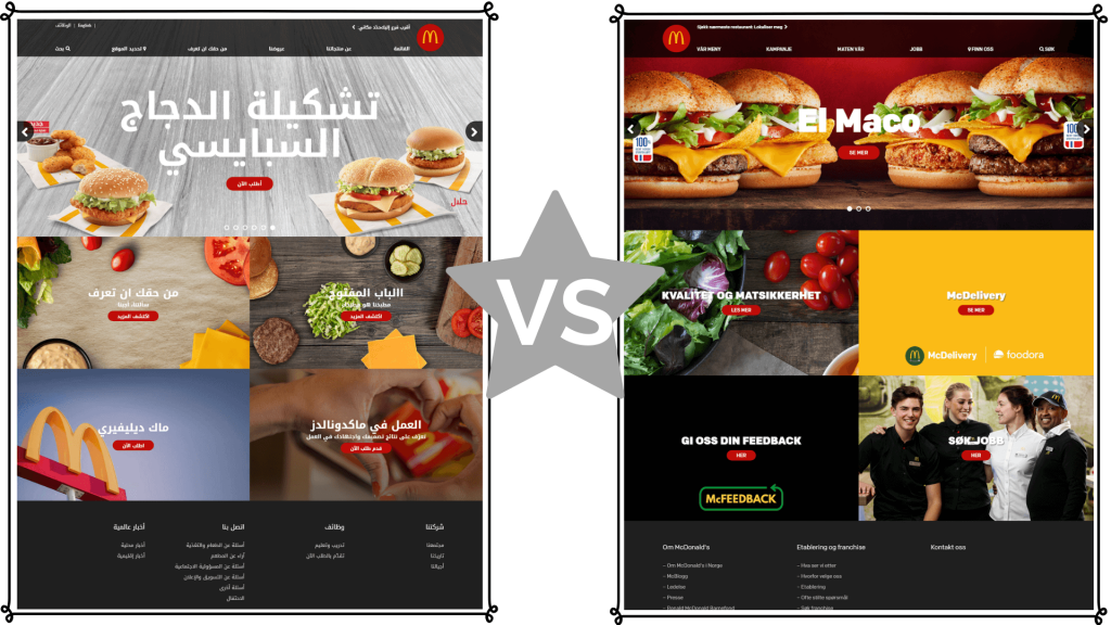
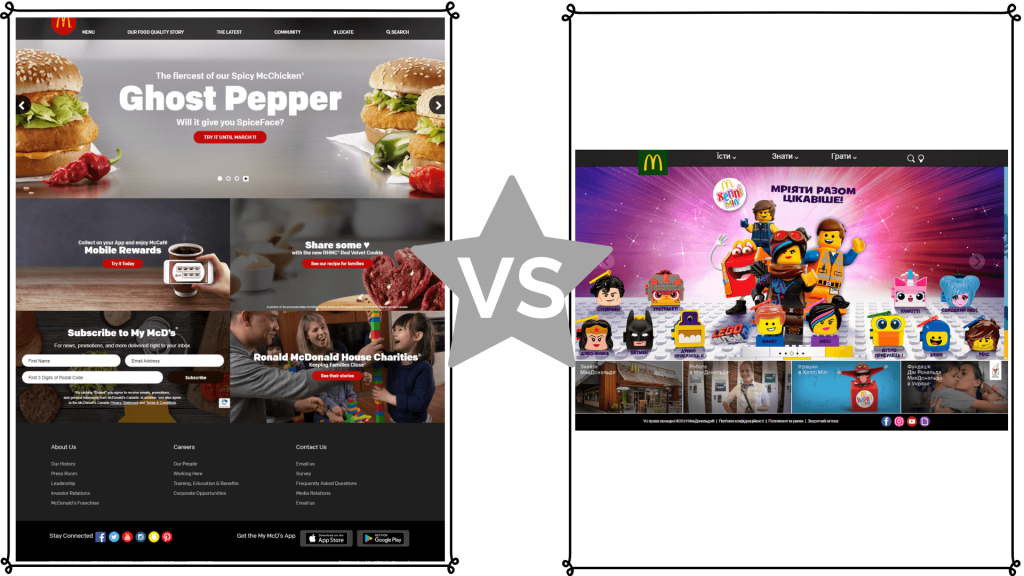
5. Uncertainty Avoidance Index
Uncertainty Avoidance Index (UAI) refers to how people deal with the uncertainties and how the society adapts to the fact that situations are not under their control.
A society with high UAI believes in its understanding and rigidly considers only what it knows. They are strict followers of orthodox culture.
The people with low UAI are open to adopting change and are flexible enough to trust new trends.
High Uncertainty Avoidance Index | Low Uncertainty Avoidance Index |
Russia Website of McDonald’s | Indian website of McDonald’s |
|
|
When looking at McDonald’s websites in Russia and India, we see how design reflects attitudes toward uncertainty.
Designers should consider these cultural differences for effective and engaging interfaces.
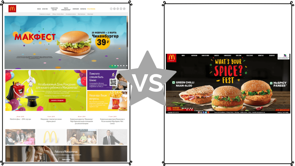
6. Indulgence v/s Restraint
A society with a high IVR score encourages and welcomes free gratification of emotions. Like emotions of enjoying, happiness, fun, loving, and caring.
People with low IVR scores keep their behavior, regulations, conduct, and emotions under control.
High Indulgence v/s Restraint score | Low Indulgence v/s Restraint score |
Canadian Website of McDonald’s | Ukraine website of McDonald’s |
|
|
When looking at McDonald’s websites in Canada and Ukraine, we notice how design reflects attitudes toward indulgence and restraint.
Designers should consider these cultural differences to create interfaces that effectively engage users.
"Ever wondered why some brands excel globally while others struggle to connect with diverse audiences?"
It's all in the design. At TRooTech, we specialize in crafting cross-cultural web designs that resonate with audiences worldwide.
Gone are the days of one-size-fits-all approaches.
To truly internationalize your brand online, you need to understand the nuances of different cultures. Our team dives deep into cultural attributes to ensure your website speaks directly to your target audience, no matter where they are.
From color schemes to UI elements, we leave no stone unturned in optimizing every aspect of your website for maximum impact.
Our goal?
To bridge the gap between your business and your customers' preferences seamlessly.
Ready to take your brand global?
Let us help you navigate the complexities of cross-cultural web design.
Reach out to us today and unlock a world of opportunities for your business.
FAQs
Individuals often search for information on Cross-Cultural Web Design Guides to understand how they can improve their UI/UX skills by creating websites that cater to diverse cultural preferences and user experiences, using McDonald's as a case study.
Individuals often search for guidelines and tips on designing cross-cultural websites, exploring factors such as language, imagery, color schemes, navigation, and cultural sensitivities, and how they influence user engagement and satisfaction.
Many small business owners and entrepreneurs seek practical advice on leveraging insights from McDonald's cross-cultural web design guide to enhance the effectiveness of their website's user interface and user experience, to expand their reach and customer base.
Cultural sensitivity significantly impacts user engagement across diverse demographics by respecting and addressing the cultural backgrounds, values, and preferences of users. By incorporating culturally sensitive elements into web design, platforms create inclusive experiences that resonate with a broader audience, fostering trust, satisfaction, and repeat visits.
When it comes to UI/UX design development services, TRooTech stands out as a top choice. TRooTech is renowned for its expertise in creating visually appealing, user-friendly interfaces that enhance user experiences and drive business success. With a dedicated team of skilled designers and a client-centric approach, TRooTech ensures that every project is tailored to meet the specific needs and goals of its clients.
More About Author

Vishal Nakum
Vishal Nakum is a tech enthusiast with a passion for exploring the latest developments in the world of technology. He has a keen interest in emerging technologies such as Artificial Intelligence, Machine Learning, and Blockchain, and enjoys keeping up-to-date with the latest trends and advancements in these fields. Vishal is an avid learner and is always on the lookout for new ways to expand his knowledge and skills. He is also a creative thinker and enjoys experimenting with new ideas and concepts. In his free time, Vishal enjoys playing video games and reading books on technology and science.